Configure and Run Query
Video Walkthrough
Overview: What are we Doing?
In this walkthrough we will configure a chart that uses the datasource that we connected: public.netflix_titles
As a recap, this data contains information from 2017 to the present about movies and TV shows featured on the Netflix platform. We'll continue where we last left off (Create a Chart) by configuring and displaying a chart.
Goal
Today we will create a Sunburst chart that shows the different types of programs on Netflix and how they break down in terms of their ratings
So let's dive in!
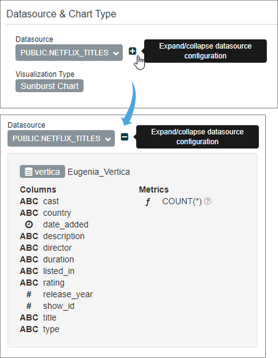
Step 1: Check the Datasource and Chart Type
Have a look at the Datasource & Chart Type panel to make sure that everything is the way you like it. In this walkthrough we're going to start with the following settings:
- Datasource: public.netflix_titles
- Visualization Type: Sunburst Chart
If you need to change anything, just select the dark grey field and make a new selection.
Curious what's in your data? Select the small plus icon next to the datasource to see the available columns and metrics. Here's what the icons mean:
- Clock: The datasource's time column (used below)
- ABC: Text data
- #: Numeric value data
- ƒ: Function used for metrics
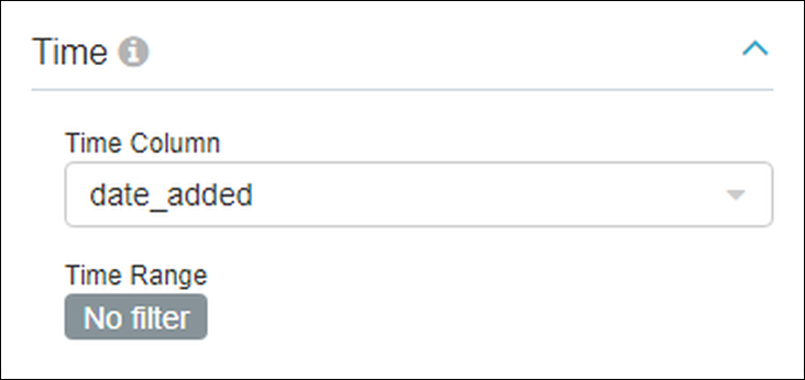
Step 2: Define the Time Settings
On the left side of your scren there is a panel called Time. This area is used to select the time-related data element (Time Column field) within your datasource and a time range. In some charts you will also be asked to select a time granularity.
Time Column Field
The chart we'll be creating today is fairly straightforward. You'll notice that the Time Column field is already populated with the datasource's time-related option, which is date_added (the column with the clock icon above). So there is no need to do anything here.
Time Range Field
The Time Range field is used to specify date ranges from which data will be extracted from the datasource. In many instances you may only want to look at information from last week, the last day, or a custom date range. If you'd like to include ALL of the data from the datasource without filtering by time, then select No filter.
You'll notice in the graphic below we select No filter — this datasource includes about 2 years worth of Netflix data, which is a good sampling to use for our purposes.
Step 3: Define the Query
What data do we want to include in the chart? That's the purpose of the Query panel!
Remember when we expanded the datasource in Step #1 to see what was inside? Well, here's a rundown of what each data element is:
- cast: Leading actor;
- country: Country of production;
- date_added: Date when the title was added to Netflix;
- description: A description of the movie or TV show;
- director: The director of the program;
- duration: If a TV show, then the number of seasons. If not a TV show, then the number of minutes;
- listed_in: The category of the program (kids, horror, etc.);
- rating: The rating of the program (PG, PG13, R, etc.);
- release_year: The year when the program was released;
- show_id: A unique ID number assigned to each program;
- title: The name of the program;
- type: Whether the program is a TV show or a movie; and,
- COUNT: The default metric that simply provides the current number of a configured chart (50 titles, 6 titles, etc.).
When creating a chart, it's always helpful to get to know your data so that you can explore creative ways of visually conveying your dataset.
Let's go ahead and see how we configured this chart, then we'll explain the purpose of each field:
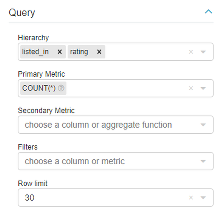
Query fields for a Sunburst chart include:
- Hierarchy: The columns that should be included in the chart;
- Primary Metric: The metric that we will use for the chart. In this datasource, there is one metric available;
- Secondary Metric: Uses a linear color to convey a ratio between primary & secondary metrics. If selected, then you can define a linear color in the Customize tab. N/A here;
- Filters: Define this to only display certain data; and,
- Row limit: Limit the number of results that will appear in the chart.
Try defining the fields, as shown above, then in the Content Panel to the right, select Run Query.
Step 4: Run the Query
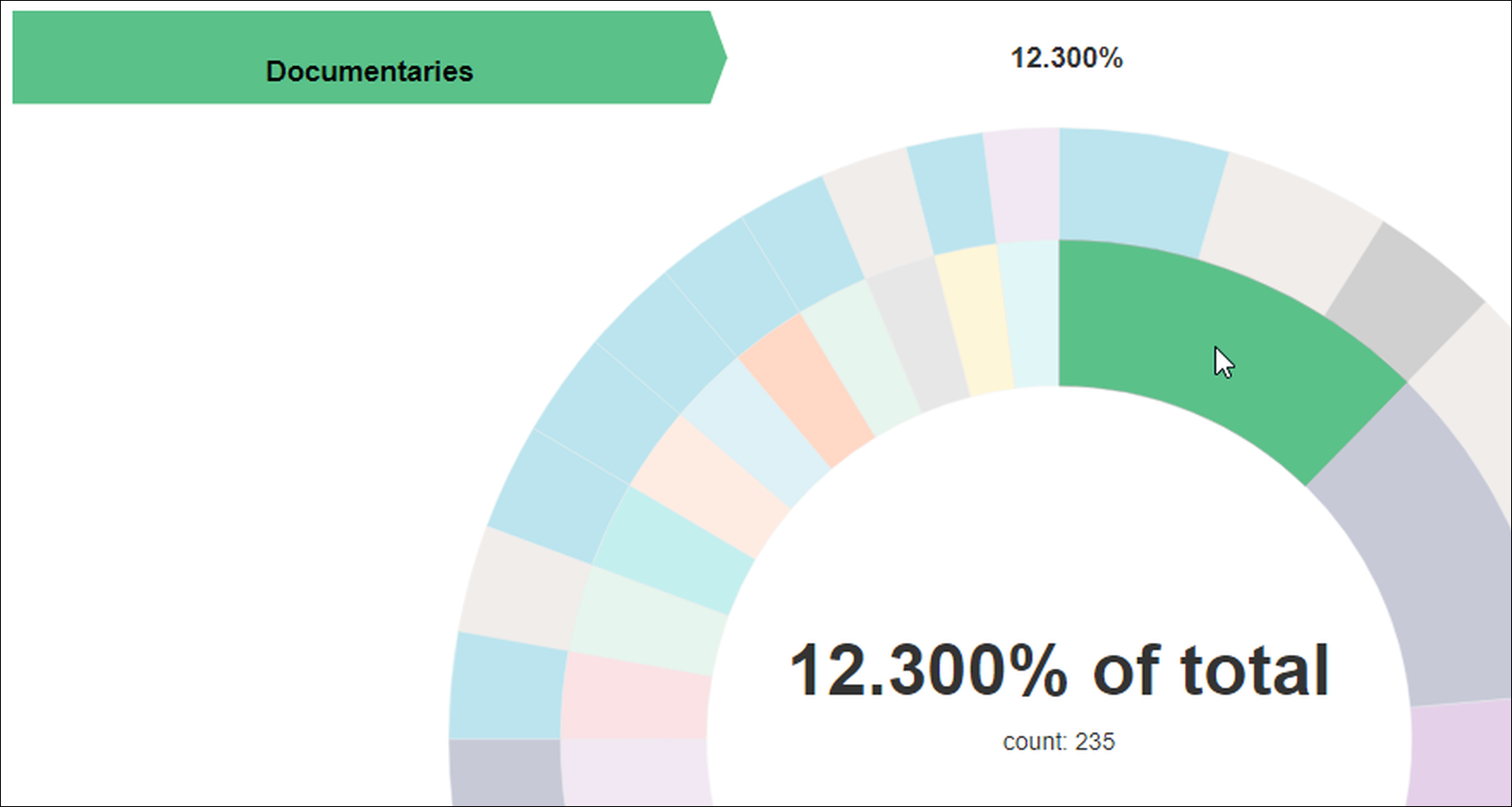
After running the query, we see a pair of concentric circles. The sunburst chart is, by nature, an interactive chart that requires hovering the cursor over graphic elements to view data.
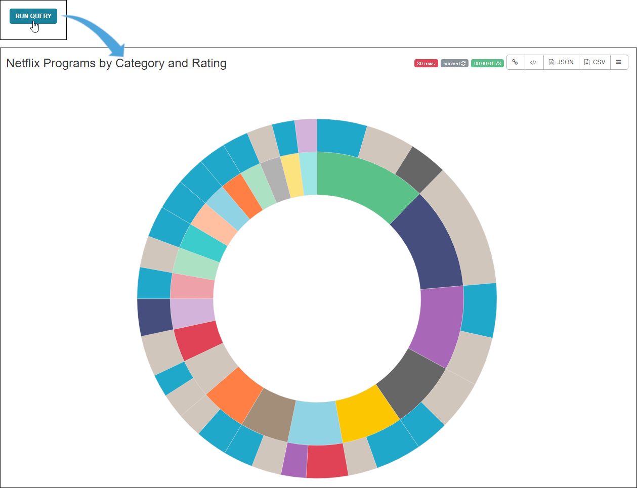
By hovering the cursor over a section, we can see the name and associated percentage that the data comprises. In the graphic below, the innermost circle represents the "listed_in" column (i.e., category), so here we can see that 12.3% of Netflix titles are documentaries.
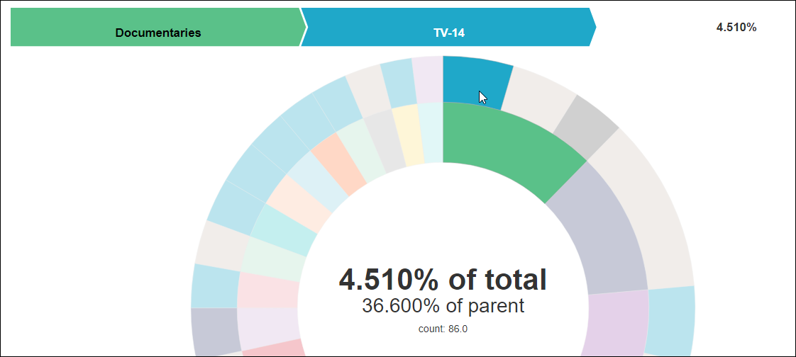
The outermost layer represents the next hierarchy column, which is "rating." In the graphic below, we see that 36.6% of all documentaries are rated TV-14 and the combination of documentaries that are rated TV-14 represent 4.51% of all Netflix titles.
Step 5: Customize your Chart
Preset charts offer varying degrees of customization. In Preset, the sunburst chart's color scheme can be changed. In other (more complex) charts, you will have a wide degree of latitude in terms of labeling, formatting, and displaying chart data.
First, though, let's give our chart a name. In the content panel, just click on the word Untitled and enter a name. For this example, we'll name our chart Netflix Programs by Category and Rating.

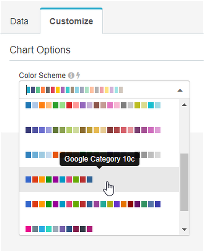
To customize, just select the Customize tab to see what options are available to you.
This is how to change the color scheme:
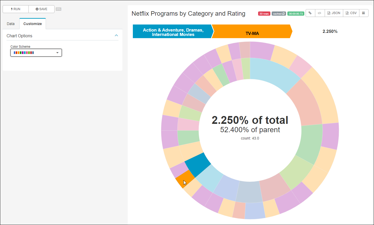
...and here's our sunburst chart using a different color palette:
Step 6: Experiment
Try experimenting with different chart types and configuration settings to see how your data can be expressed in multiple ways.
As an example—for an entirely different look—try changing the chart type to a Pie Chart:
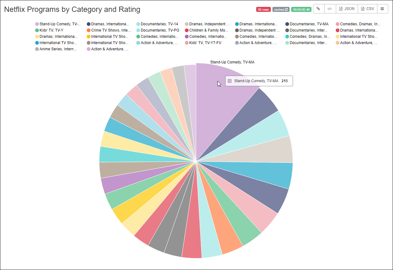
Some tips:
- Remember that the type of data you're working with usually works best with certain chart types. Netflix data, for example, may be best visualized using data composition charts, such as word clouds, pie charts, and bar charts.
- Expand or contract your time range to access more or less data, respectively.
- Likewise, change series limit fields to increase or decrease the amount of data displayed in the chart.
- Try using different columns in different combinations to see what works best for the story you are trying to tell in your chart.
Save the Chart
As a final step, let's save our new chart. Above the Data and Customize tabs, select Save.
.png)
Select the Save as... option and then select Save. You'll notice that the Chart Name field is already populated with the title you entered earlier — you can change this if you like.
.png)
Ready for the Next Step?
If you'd like to see some other examples of different chart types created from the Netflix data, please see Chart Examples. If you're ready to learn about Dashboards, then let's dive in to Introduction to Dashboards!