Dashboard Features
Component Overview
In order to familiarize yourself with Preset dashboards, let's look at an overview of its components:

Grid-based Layout
As you can see, the Dashboard screen is configured in a grid layout comprised of rows and columns.
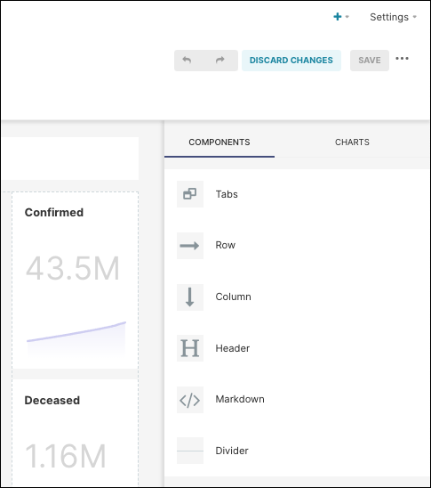
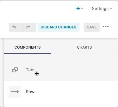
New rows and/or columns can be added to a dashboard by selecting Edit Pencil, then Components.
In the panel on the right, drag & drop a row or column into the dashboard area as needed.
Filtering Data
A dashboard that includes the Filter visualization type enables users to directly filter data on all charts within the dashboard.
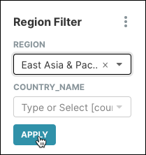
For example, in the World Bank Data dashboard, the filter visualization looks as follows. For easy access, we recommend placing filters in the upper left of dashboards:

To illustrate, let's filter by the region field by East Asia & Pacific:
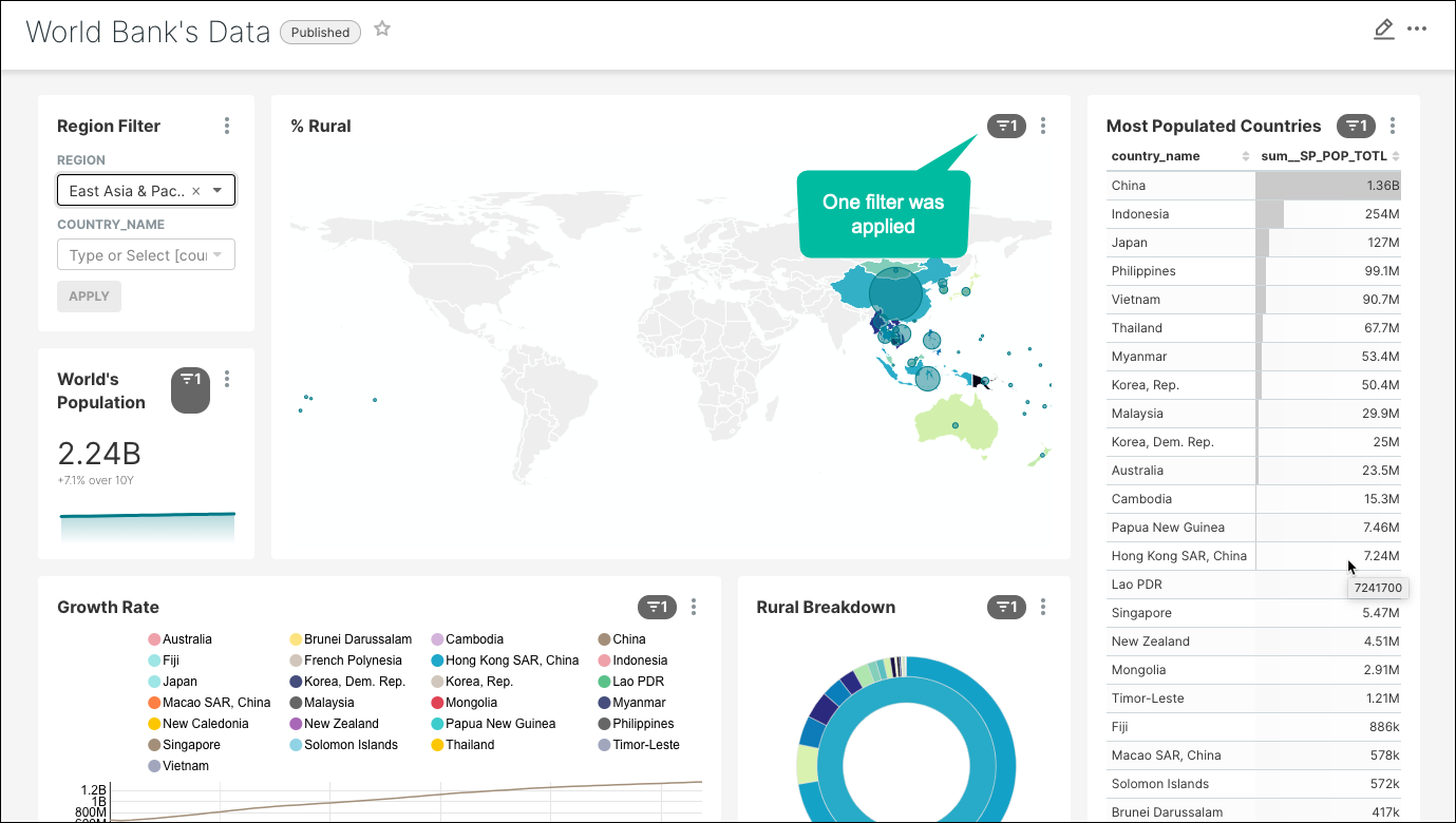
As you can see, the dashboard charts have been modified to reflect the filtered selection:
If you would like to apply sets of filters to specific charts, then you can use the Filters tool.
Let's have a look by selecting **Edit ** and then in the menu selecting Set filter mapping.
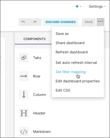
This takes us to the Configure Filter Scopes panel, where we can apply one or more filters to specific charts in the dashboard. Simply select filters on the left and then select charts on the right — when done, select Save.

Tabbed Content
Dashboard content can be organized into tabs for navigation and presentation purposes.
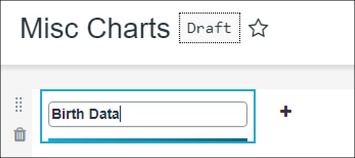
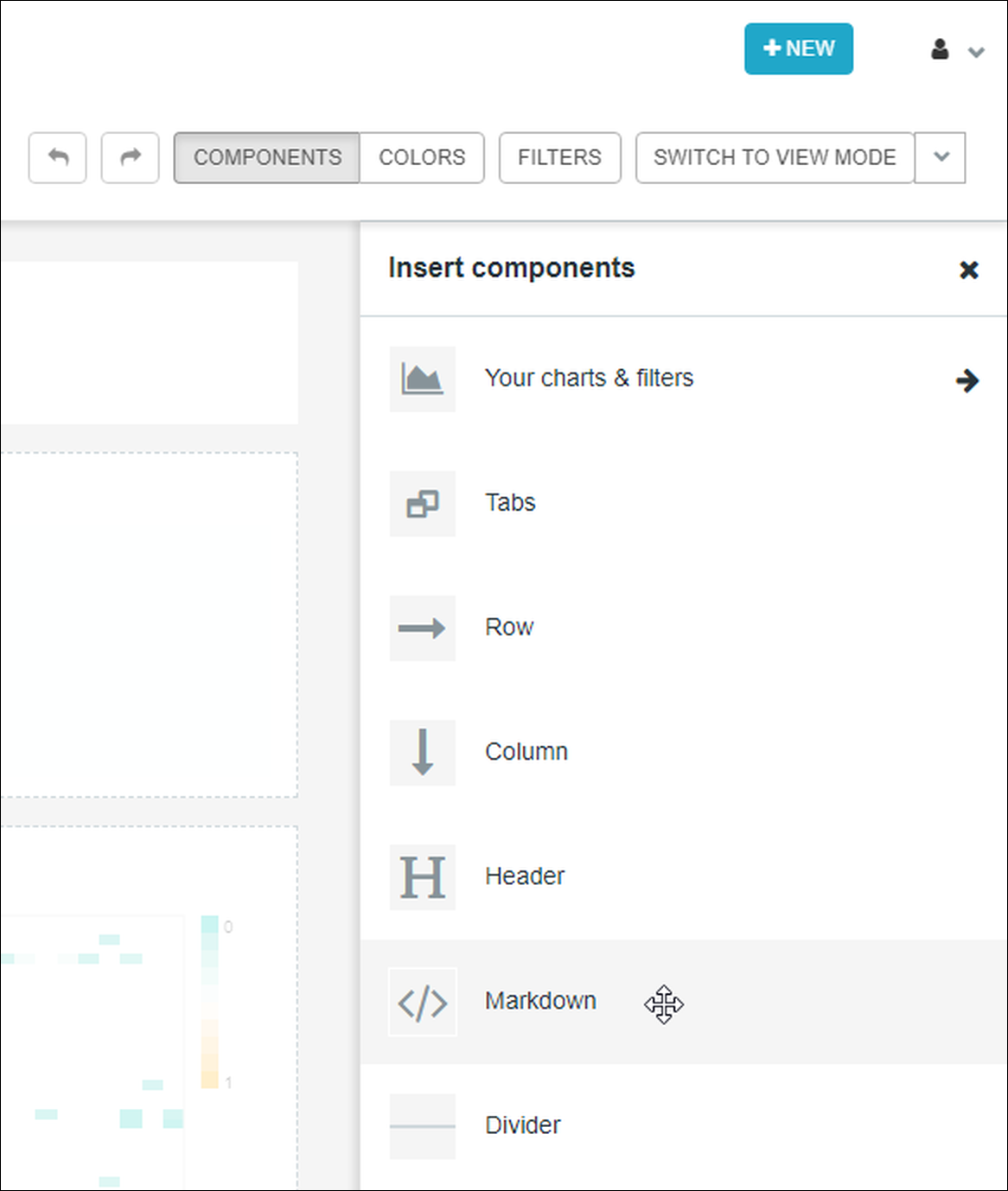
Let's start by navigating to the Tabs tool by selecting Edit Dashboard. From the Components panel, which appears by default, you can add a new tab by dragging & dropping Tabs into the dashboard area.
After the new tab is in place, you can assign it a name by clicking on the tab and entering a new label.
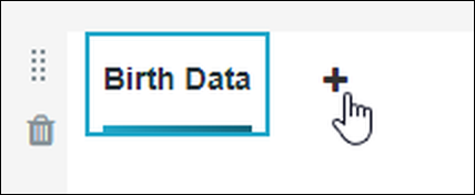
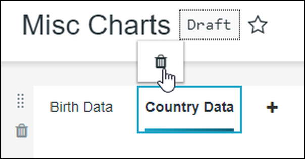
To add a new tab, just select the + icon.
...and to delete a tab, select a tab and then select the trash icon. After doing this, a warning message appears explaining that all content within the tab will also be deleted, so ensure that your tab is either empty of content or you are comfortable with tab content being deleted. When ready, select Delete.
After your tab infrastructure is set up, remember to select Save Changes. At this stage, simply select a tab and proceed with adding or removing charts as needed.
Markdown Component
Dashboard content can be customized using markdown, CSS, and/or HTML.
You can do this by adding a markdown section to the dashboard by selecting Edit Dashboard and then dragging & dropping Markdown to the dashboard
For example this imagery:
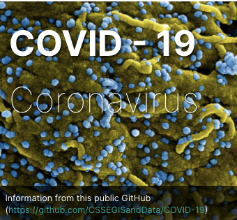
...can be created from the following sample code:
Markdown Example
HTML Example
iFrame Container
CSS Customization
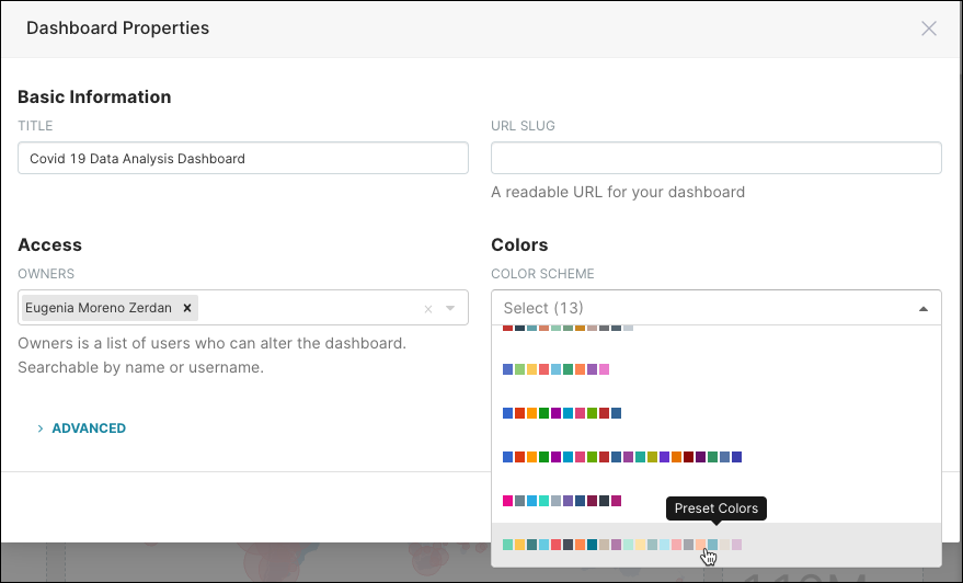
Color Customization
To change the color scheme used on your dashboard, just select Edit Dashboard, in Dashboard Menu select Edit Dashboard Properties then Colors, and then select a color scheme option from the Color Scheme field.