Using Dashboards 2
How to Add a Chart
There are two ways to add a chart to a dashboard: when saving a chart and when editing a dashboard. Let's look at both methods.
When Saving a Chart
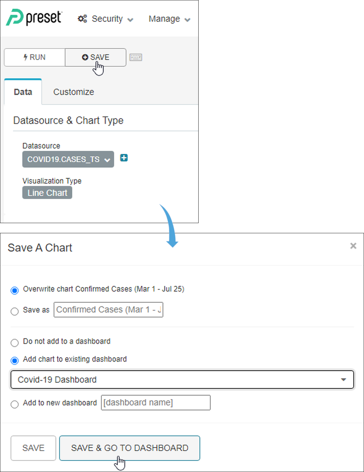
While in the Edit Chart interface, select Save.
In the Save A Chart panel, indicate whether you want to overwrite the existing chart (if applicable) or save the chart under a different name.
Next, select Add chart to existing dashboard and then select a dashboard. This is useful if you have already created a blank dashboard or if you want to add another chart to a dashboard.
If you do not yet have a dashboard, then select Add to new dashboard and then enter the name of your new dashboard.
When all done, select Save & Go To Dashboard.
When Editing a Dashboard
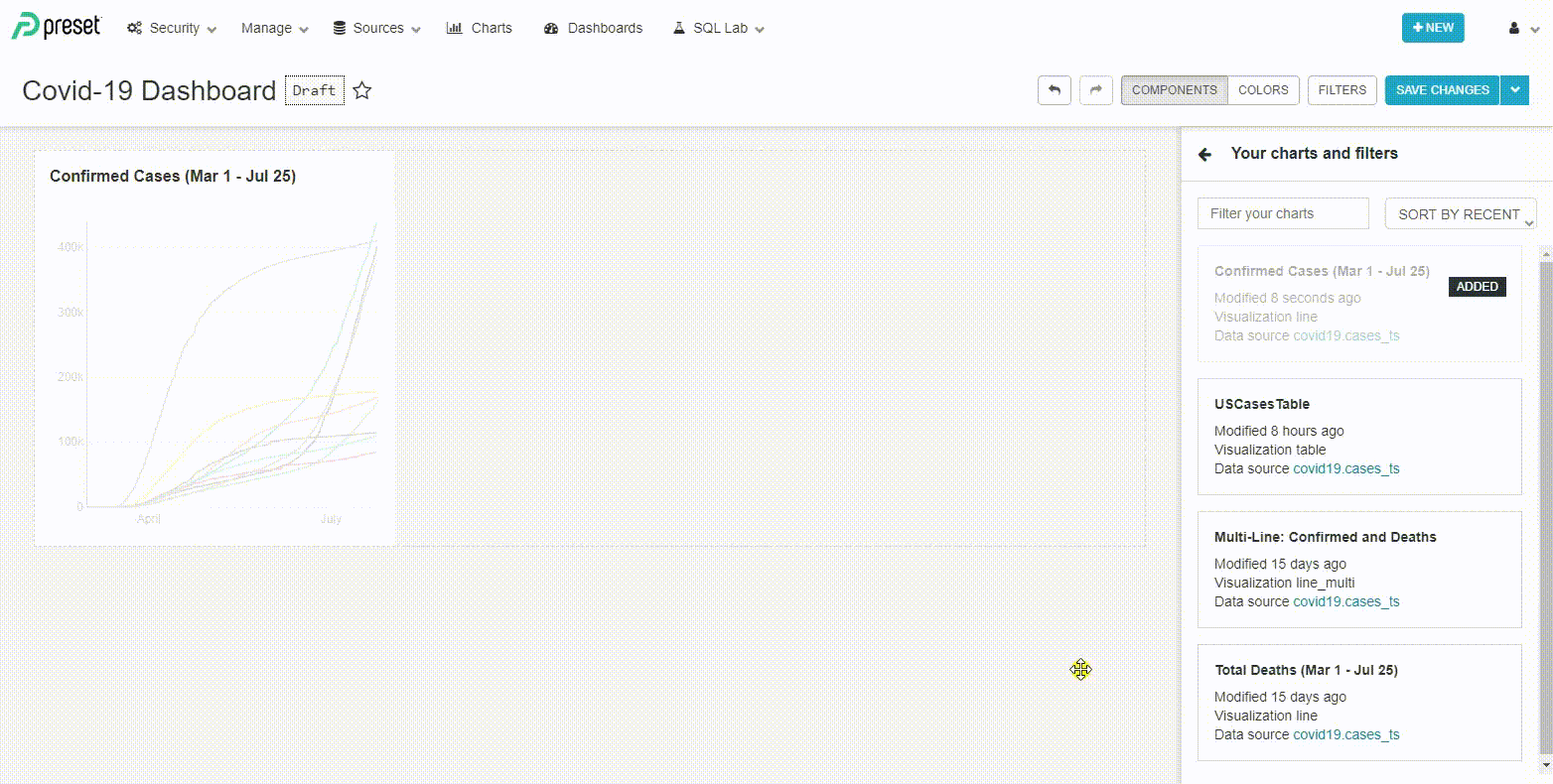
From a dashboard, select Edit Dashboard and then, in the Components panel, select Your charts & filters.
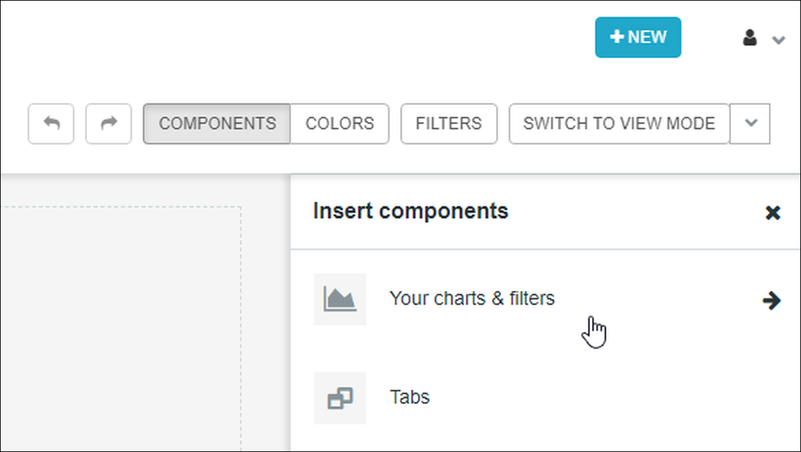
The Your charts and filters panel displays a list of all your charts. Simply drag & drop a chart from this panel into the dashboard and that's it!
How to Remove a Chart
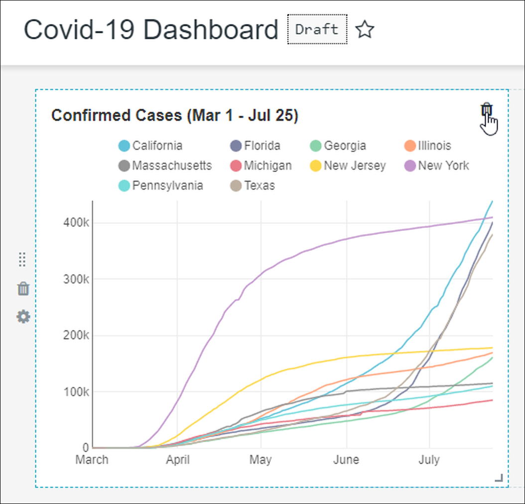
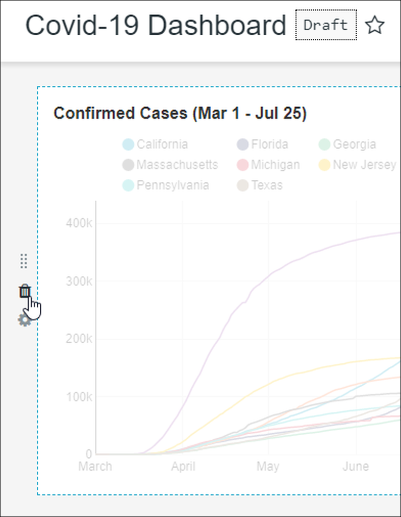
To remove a chart, select Edit Dashboard. While your cursor is hovering over a chart, select the trash icon in the upper-right corner of the chart:
To delete an entire row of charts, select the trash icon on the far left side of the row:
How to Create a Filter
Creating a dashboard filter actually follows the same process as creating a new chart, except the visualization type is called a Filter Box.
Create Filter Box
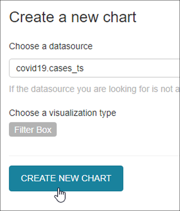
Start by selecting New → Chart in the Toolbar. The Create a new chart screen appears.
In the Choose a datasource field, select a datasource. The fields in this datasource will be available for filtering on the dashboard, so ensure that the datasource is also used by the charts that will appear in your dashboard.
In Choose a visualization type field, search for and select Filter Box then select Create New Chart.
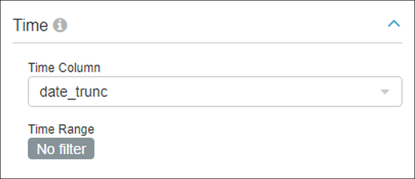
Configure Time
In the Time panel, select the relevant date field from your datasource in the Time Column field — these will include the option "temporal."
In the Time Range field, if you wish to apply a time filter to all dashboard charts then select and choose a filter (e.g., Last week, Last month, etc.). Alternatively, select No filter and then select the Date Filter checkbox below the Filters Configuration section — this will enable users to select their own time filters to apply to dashboard charts.
Configure Filters
This section is used to add filters that you want to make accessible for the dashboard charts.
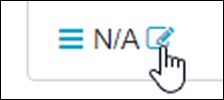
To add a filter, just select the plus icon:
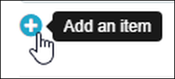
...and then the edit icon to configure filter fields, as follows:
In the example below, we configured the province filter (in the Column field) to display as "State or Province" by modifying the Label field.
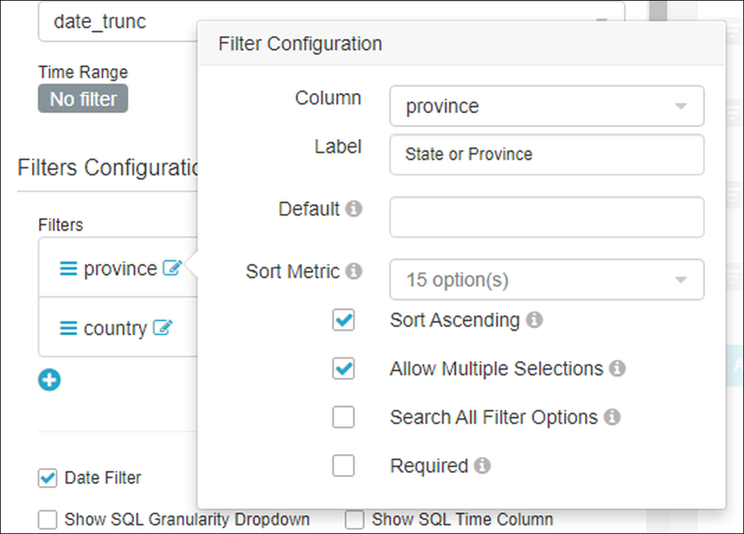
You can also:
- Specify sorting options (Sort Metric and Sort Ascending fields);
- Define a default filter option (Default field), make it required (Required checkbox); and,
- Enable dynamic searching of datasource rows exceeding 1000 (Search All Filter Options checkbox).
Other Filter Box Options
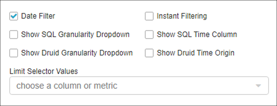
Below the Filters Configuration panel are a series of additional options that can be toggled on or off. Of particular note here is the Date Filter, which will enable you to apply a time filter to all dashboard charts.
The Limit Selector Values field is used to limit available options in the filters.
Run Query and Save to a Dashboard
When done, select Run Query and then save your Filter Box to a dashboard by selecting Save (described above in the When Saving a Chart section).
Next, browse to your dashboard to see your new filter. You may want to select Edit Dashboard, which will enable you to move and re-size the Filter Box as needed.
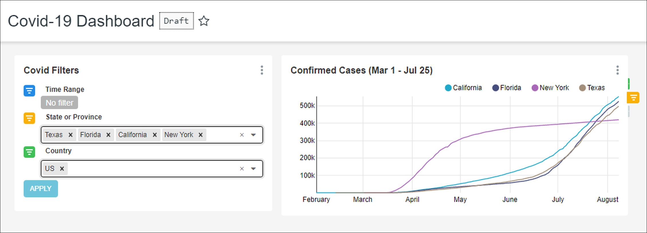
Here's what the above example looks like:
Dashboard Options
From the dashboard screen, select the Edit Dashboard drop-down icon to view the following dashboard options:
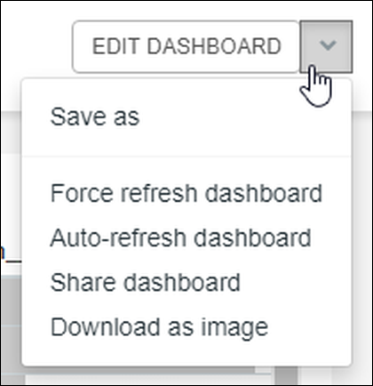
- Save as: Select to save the current dashboard (i.e., overwrite current filename) or save the dashboard to a new filename.
- Force refresh dashboard: Select to refresh all dashboard charts (i.e., retrieve all data).
- Auto-refresh dashboard: Select to specify an automatic refresh rate for the dashboard. Options include seconds (10 or 30), minutes (1, 5, or 30), or hours (1, 6, 12, or 24).
- Share dashboard: Select to display a unique URL for the dashboard, which can then be copied to the clipboard or sent by e-mail using your system's default e-mail client.
- Download as image: Select to download an image of the dashboard to your system in JPG format.
Chart Options
From the dashboard screen in View mode, hover your cursor over a chart to enable the vertical ellipsis icon. Select this to display a list of chart options:
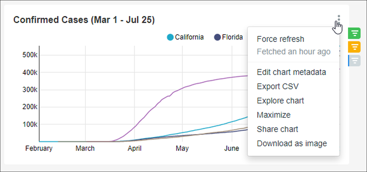
- Force refresh: Select to refresh the chart's data.
- Fetched x: Notification informing you of when the last data refresh took place (e.g., Fetched an hour ago, Fetched 8 hours ago, and so on).
- Edit chart metadata: Select to launch the Edit Chart screen, which enables you to modify chart details such as name, description, visualization type, owners, dashboards, JSON object parameters, and cache timeout.
- Export CSV: Select to download the chart in comma-separated value (CSV) format.
- Maximize: Displays the chart in full screen mode.
- Share chart: Select to display a unique URL for the chart, which can then be copied to the clipboard or sent by e-mail using your system's default e-mail client.
- Download as image: Select to download an image of the chart to your system in JPG format.
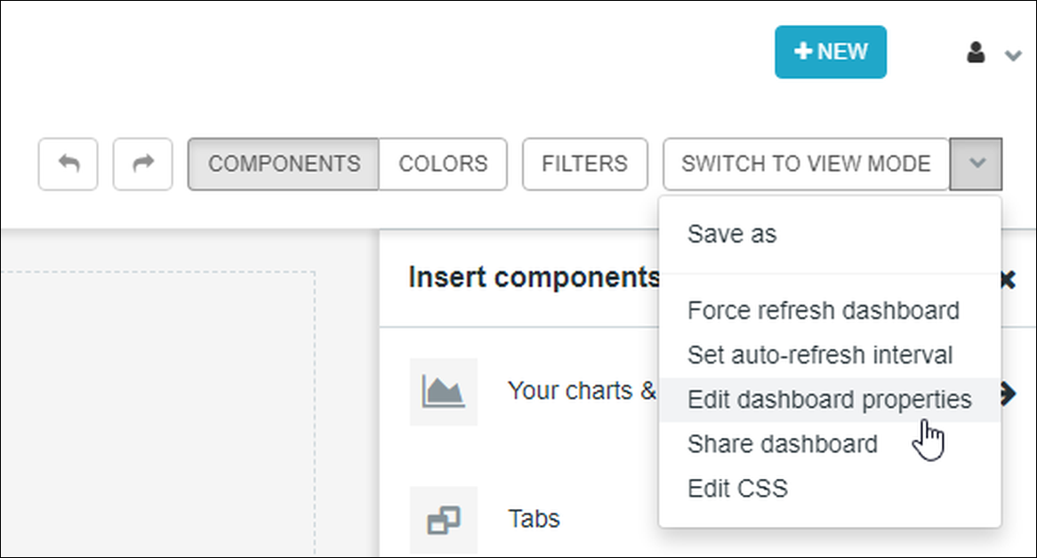
Edit Dashboard Properties
In addition to the metadata content mentioned above, you can also directly edit dashboard properties such as the title, URL slug, and access.
To launch dashboard properties, select Edit Dashboard and—in the Switch to View Mode drop-down menu—select Edit dashboard properties.
The dashboard properties panel appears:
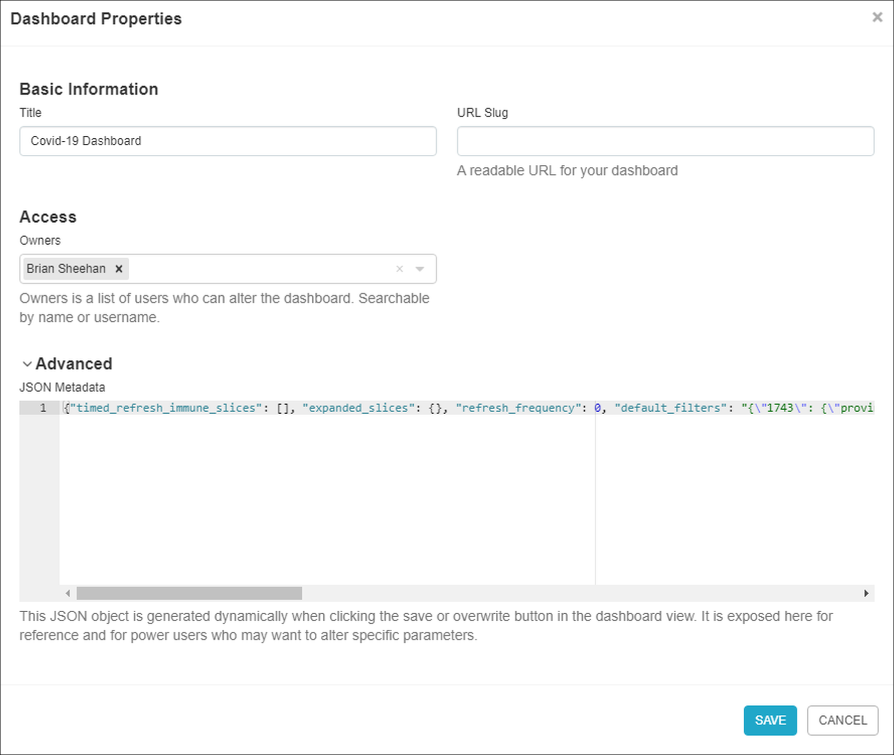
In the dashboard properties panel, you can edit the following:
- Title: The title of the dashboard.
- URL Slug: Customize the end of the URL (slug) to a more memorable name.
- Owners: Assign/remove access to the dashboard.
- JSON Metadata: By expanding the Advanced header, the JSON Metadata panel appears. This area is for power users who may wish to alter specific dashboard parameters.